Role: Director of Product and Motion Design (player/coach)
Collaborators: VP of Marketing, FocusLabs (Design Agency), Sr Product Designer, Principal Motion Designer
Collaborators: VP of Marketing, FocusLabs (Design Agency), Sr Product Designer, Principal Motion Designer
A Shift in Target Audience
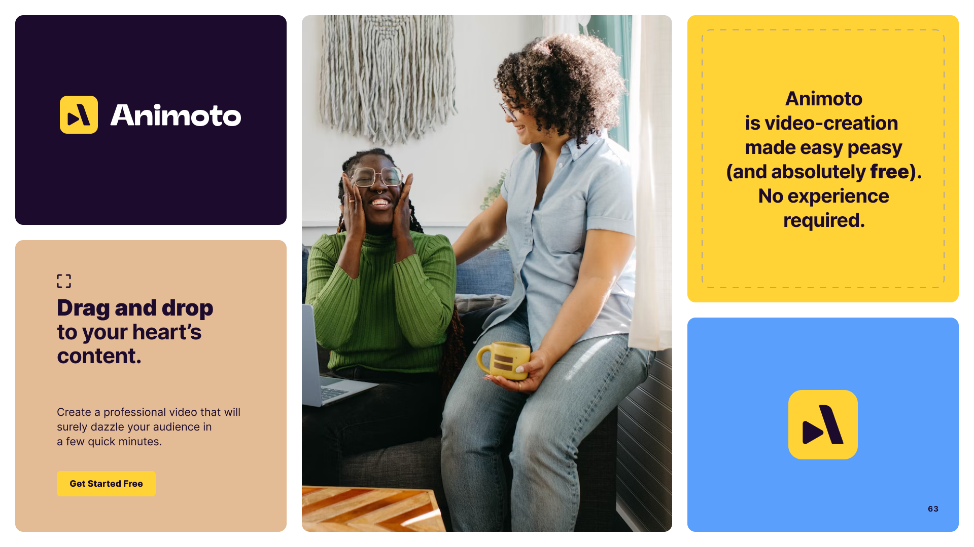
Animoto is a web-based video editing platform created to make video editing easy for everyday users. At the beginning of 2023, Animoto shifted its business model tactics from targeting everyday consumers to focusing on small and medium-sized businesses (SMBs). This shift necessitated a brand refresh to reflect the new customer focus. With the rebrand came a few challenges that also needed to be solved. The old brand heavily relied on illustration, which didn't effectively showcase Animoto's video editing experience. Additionally, the existing brand lacked cohesion, with inconsistencies in logo usage, color application across the website, and the complete absence of defined brand guidelines.
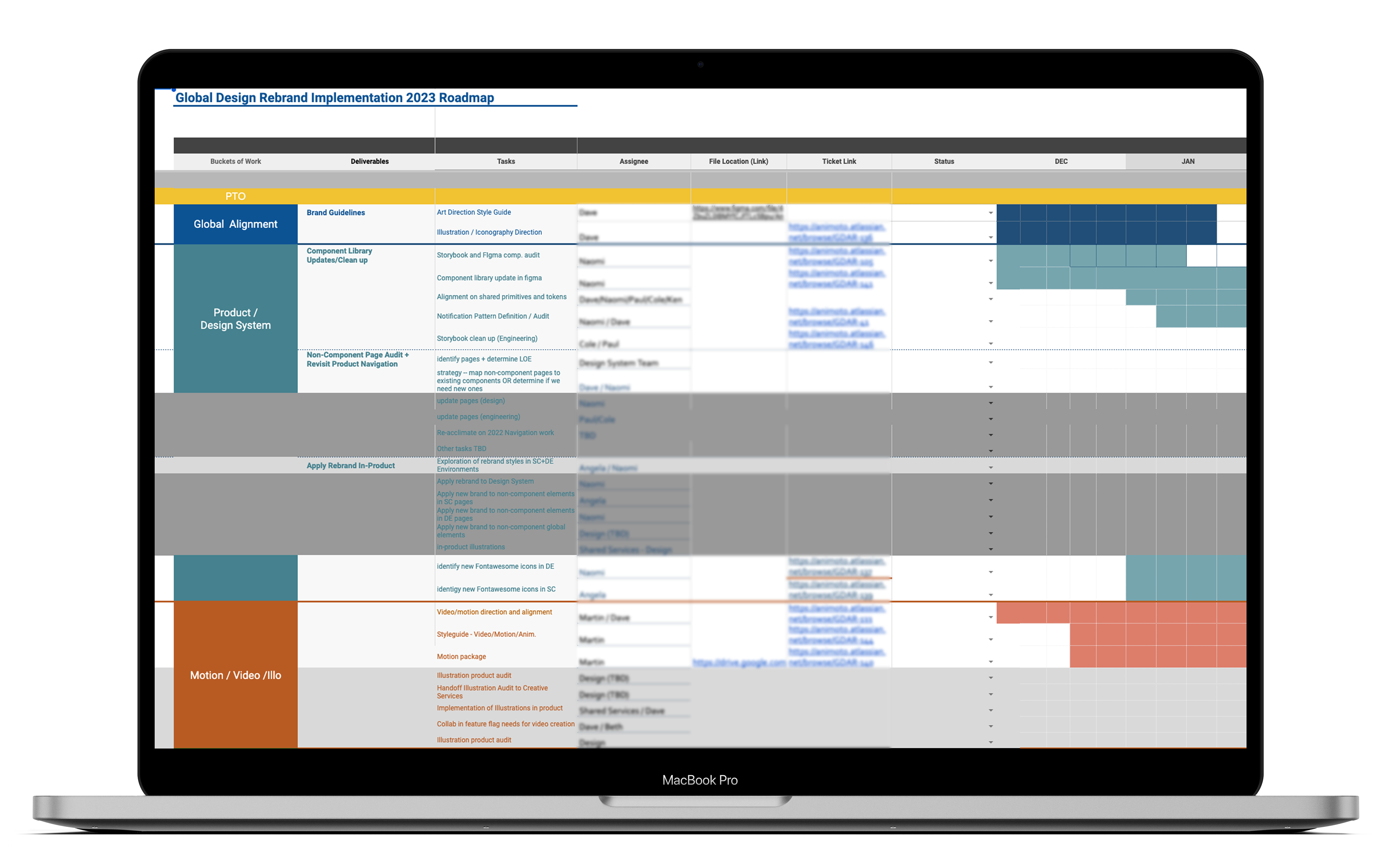
I partnered with the VP of Marketing and FocusLabs (a brand agency) to lead the initiative. After months of collaboration with FocusLabs and internal stakeholders, and several design iterations, we landed on a new identity in which we felt confident. Once FocusLab delivered new visual brand guidelines, we began a massive initiative of in-house implementation.
To track our progress, I developed a comprehensive roadmap and outlined necessary workstreams defined as:
Educating the Internal Team: We set out to equip the internal team with a thorough understanding of the "why" behind the rebrand.
Unifying User Experience: We needed to strategize how the brand would be applied across the user experience, encompassing both the marketing site and the in-product experience. With our newly refactored design system, we began by creating a new set of design tokens.
Brand Strategy for Assets: We needed to develop a strategy for how the new brand would be reflected in video, motion graphics, and illustrations.
New Brand, Who Dis?
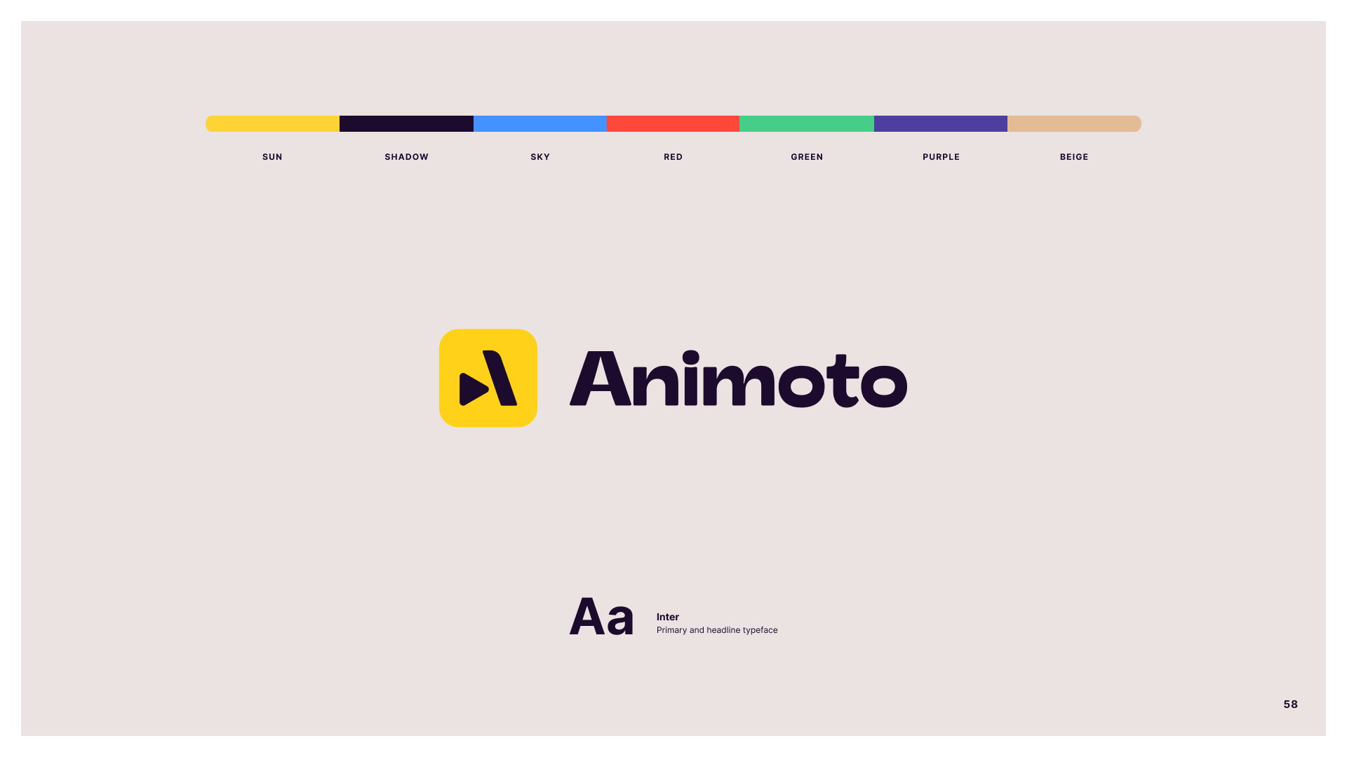
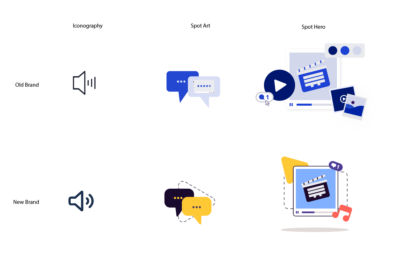
The rebranding initiative resulted in a cohesive and consistent brand experience across all Animoto touchpoints. I expanded the brand guidelines from FocusLab's handoff to include a focus on art direction for video, motion, and illustration. In collaboration with the Principal Motion Designer, we established a set of rules and styles for how motion and video are utilized internally. This resulted in a set of motion packages utilizing the visual shape language, empowering the marketing team to create on-brand videos independently, and boosting marketing video output efficiency.

Illustration Redefinition: I redefined illustration guidelines, outlining fidelity and stylistic applications centered on spot art and a distinct shape language. We transitioned away from the illustration-heavy approach, employing illustrations sparingly for concepts too complex or ambiguous for video or photography. The illustration style encompassed three fidelity levels.
Iconography: To improve efficiency, we adopted FontAwesome, a third-party tool, for icons, significantly reducing design time needed to create custom icons.
Spot Art: Leveraging the existing illustration library, I created a foundation for a simple, engaging illustration style used only when video or photography couldn't convey the concept.
Spot Hero: A slight step-up in fidelity from Spot Art, this was used sparingly for scenarios like empty states.
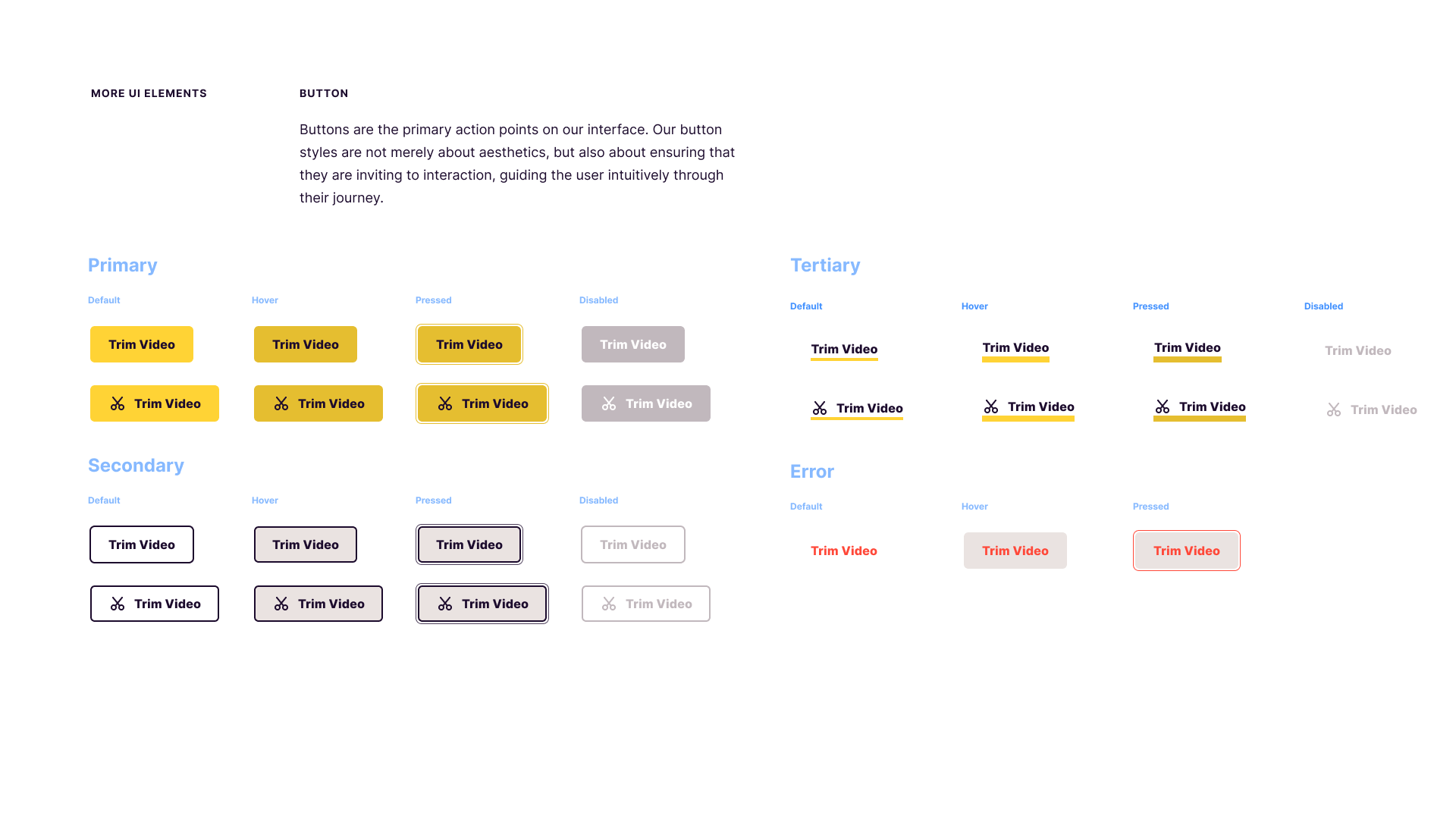
Reskinned Design System: The design system was comprehensively reskinned to reflect the new brand identity. We also took the opportunity to clean up the design system beforehand, as noted in this case study.
How Did It Perform in the Wild?
Unfortunately, due to a company acquisition and restructuring, Animoto's design team, (along with parts of its product and engineering team) were laid off, unable to see how this rebrand did in the wild. All the same, I am proud of the work our design team contributed to this, in addition to their daily product team obligations.
Unfortunately, due to a company acquisition and restructuring, Animoto's design team, (along with parts of its product and engineering team) were laid off, unable to see how this rebrand did in the wild. All the same, I am proud of the work our design team contributed to this, in addition to their daily product team obligations.